


Visualizing commuter flows in the Charlottesville area
I recently needed to research the commuting flows of the Charlottesville workforce and resident population to learn about the daytime population, and I needed to have an idea of what was happening at the neighborhood level. The U.S. Census’ Longitudinal Employer-Household Dynamics Origin-Destination Employment Statistics (LODES) made this level of analysis possible. LODES data include pairs of residence and administrative work locations at the Census Block level for about 95% of all jobs. The 2014 LODES primary jobs data and maps I developed to visualize what’s happening provide a glimpse of where workers are coming from and what the flow exchanges in the area look like.
The Charlottesville Metropolitan Statistical Area includes Albemarle County, Fluvanna County, Greene County, Nelson County, and Charlottesville City. In addition, Louisa and Augusta counties are among the top contributors of workers to Charlottesville. For these maps, I included anyone who lived or worked in the 7 localities mentioned. Workers residing outside but working in the 7 localities are categorized as “Other: in state” or “Other: out of state.”
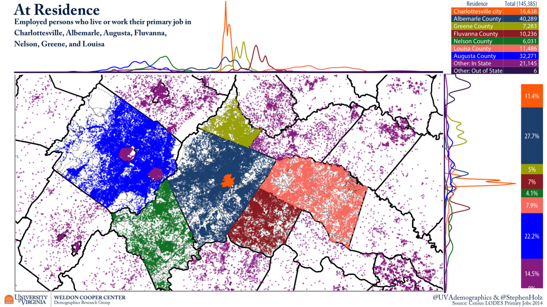
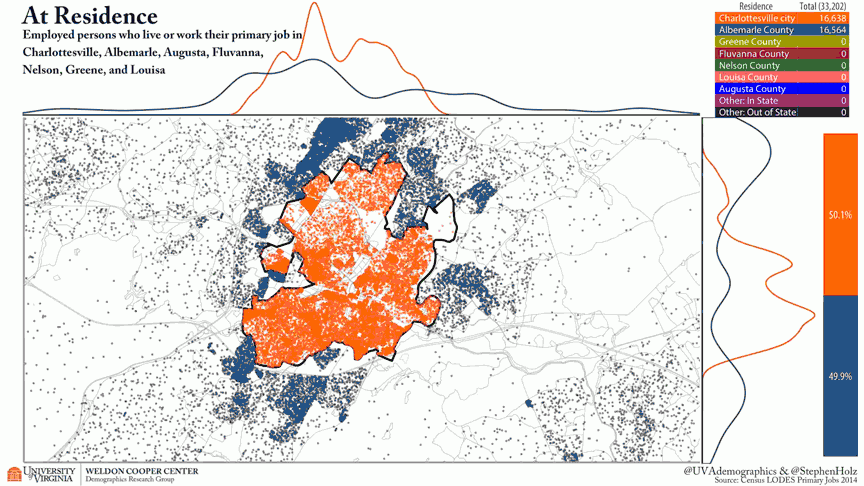
This bird’s eye view shows where the employed population live:
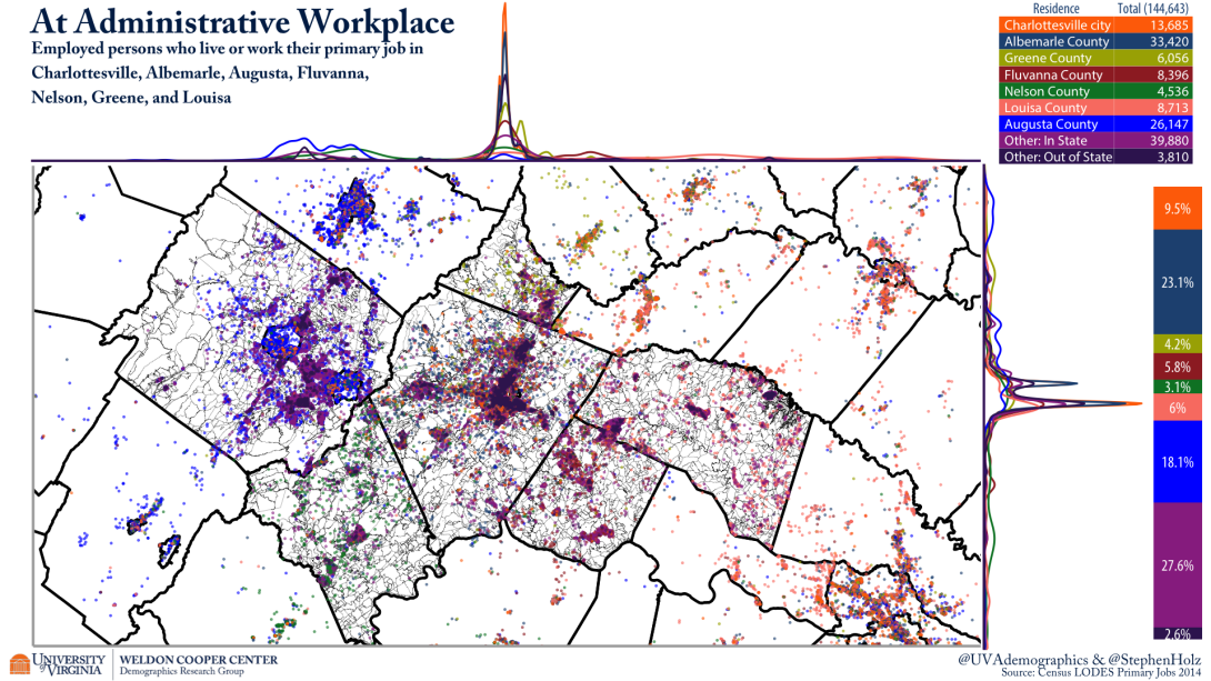
And this map shows where the employed population work:
Many people commute across locality boundaries to work. To show the commuting flows, I created an animated map by interpolating points between home and work locations:
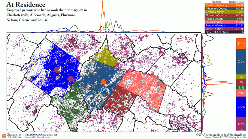
A dot map can be an effective way to show the spatial distribution of a categorical variable that varies in intensity, in this case the number of workers from many different counties. One weakness dots have is they tend to stack in clusters making relative density difficult to perceive. The kernel density estimation graphs are also included (on top of and to the right of the map) to show the relative concentration of dots by category along longitude or latitude. For more aid, there is also a table of all dot counts currently being viewed on the map in the upper right corner and the bar chart shows the percentage of dots on the map of each color.
Of the dots in view (representing the primary jobs of area workers when at their residence), Charlottesville has 11.4% and Albemarle has 27.7%. When workers are distributed in their administrative workplace blocks, those numbers drop to 9.5% and 23.1% respectively.
Zooming in closer to the City of Charlottesville, we can see the areas of job concentration more clearly.
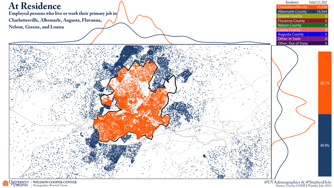
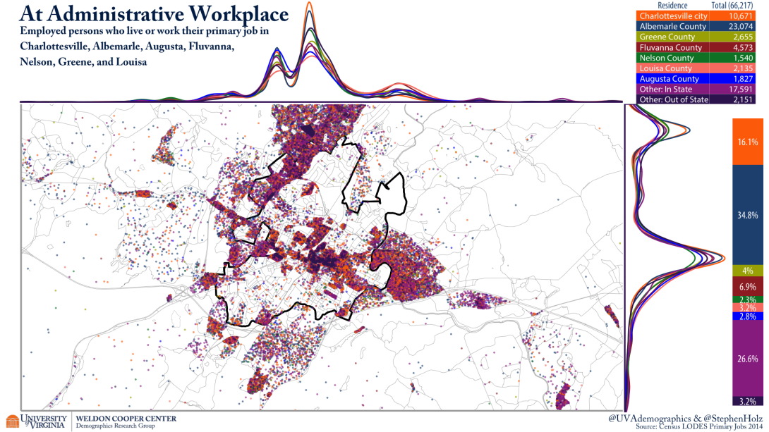
Charlottesville and Albemarle naturally increase their shares as this view is more localized. Even so, about half of the dots in view are coming in from other areas. The kernel density graphs hint that there may be some neighborhood level differences in where their workforces are coming from, which I will look at in a follow up post in the near future.
Appendix:
For those interested in the actual numbers which made the interactive maps for Charlottesville region, I have included a few tables.
The cross table of primary job flows in the Charlottesville area:

The total ratio for Charlottesville on the interactive map above was calculated using the total jobs column and the total employed residents row, or 34,708/16,638 = 2.086068 (rounded to 2.09). We can also look at the relationship between areas in a similar way to quantify how balanced the worker flows are. Charlottesville sends 5,412 workers to Albemarle and receives 11,879 in return, meaning Albemarle sends Charlottesville about 2.2 workers for every 1 sent the other way.
The relationship between Charlottesville and the counties further away is much different. Charlottesville sends Fluvanna County only 109 workers and receives 2,261. Fluvanna sends Charlottesville about 20.7 workers for every 1 sent the other way.
The cross table of the ratio of flows in the Charlottesville area rounded to 2 decimal places:

Though the flows between the outer counties have rough parity, the size of the flows compared to the workforce hardly registers. Charlottesville and Albemarle are clearly an economic anchor of the region.